This post contains affiliate links.
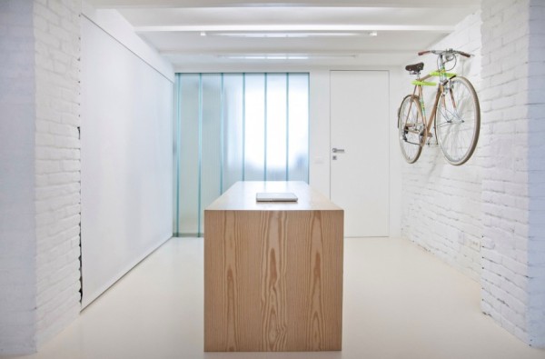
In 2013 the designers at R3Architetti in Turin, Italy were hired to help turn this shop into a beautiful tiny loft apartment for a young professional who wanted a simple living space.
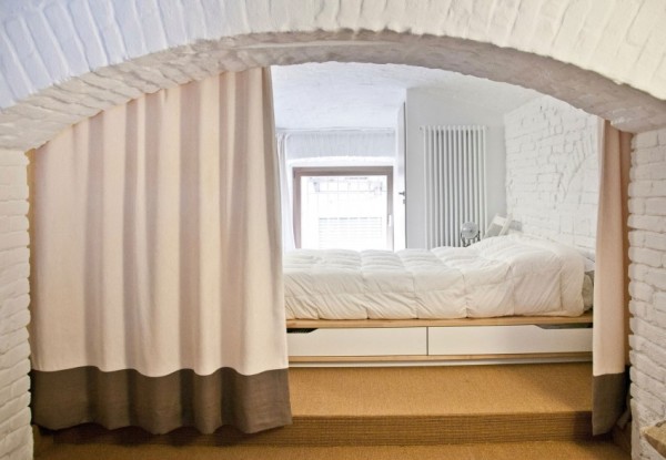
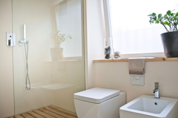
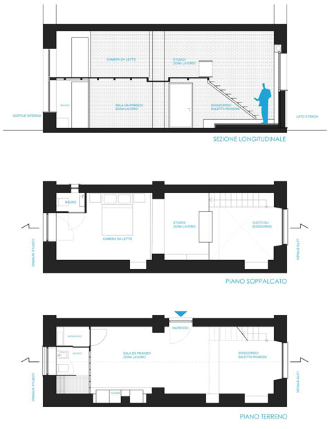
The lower level of this tiny apartment is designed for living and working. It includes the kitchen which unfortunately we don’t get to see, a bathroom, and the first floor bedroom.
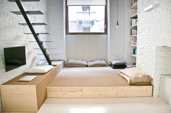
The upper level has another sleeping space as well as another study/work space and it overlooks the lower level. Please enjoy and re-share below. Thank you.
From Shop to Loft: Tiny Loft Apartment in Italy

Images © R3Architetti




Images © R3Architetti
Resources
Our big thanks to Robert Ferguson for sharing!
If you enjoyed this tiny loft apartment in Italy you’ll absolutely LOVE our Free Daily Tiny House Newsletter with even more! Thank you!
This post contains affiliate links.
Alex
Latest posts by Alex (see all)
- Her 333 sq. ft. Apartment Transformation - April 24, 2024
- Escape eBoho eZ Plus Tiny House for $39,975 - April 9, 2024
- Shannon’s Tiny Hilltop Hideaway in Cottontown, Tennessee - April 7, 2024



I agree with Hmmm up there. The location is probably expensive and stunning. And I can’t tell if the white paint enhanced the brick and stonework, or covered up some great history. This made me remember looking at an 1880s house for sale in north Georgia years ago. The owner proudly pointed out he had already jackhammered most of the old fireplace bricks from under the house to make room for “a nice clean basement.” One man’s trash would have been this woman’s treasure. 🙁
One woman’s (below) trash was this person’s treasure/self expression. So quick to judge are we humans. Try living in a narrow room of red brick – as I once did – and you might find it’s quite depressing – as I did. Then again, you might have found the same environment uplifting. It all boils down to preference.
Oh yes, love the Italian slickness and design. Would love to have this apartment in any big city. Thanks for sharing. Cheers from Australia
The most tasteful place by far on this website I have ever seen. In my eyes white paint on brick is a must for small places if you do not want to feel as if inside a pizza oven ;). All the white and natural hues make the place feel bright and calm. As long as you are young, slim and fit you won’t miss armchairs or a sofa. Lounging on the carpet floor with a lot of cushions can be pretty comfortable and relaxing. The architects did a great job here!
It’s not illegal to have furniture in Italy, is it?
It certainly is austere. I can see a young man live there, but that’s all. Furniture would certainly make the place appear a lot smaller. Those stairs? It just gives me vertigo visualizing me on them.
I agree. I was experiencing vertigo just looking at it. The whole apartment looks like a temporary crash pad for a twenty-something male. It’s a little too austere and stripped down to pipes for me. I also wondered what the place would have looked like with all that natural brick (and a few philodendrons in hanging starter tubes.)
Genius! Pure Art+Function. This space feels elegant and peaceful. Room to think and create.
Wow what a great use of space!!!! I never like the 20 ft ceilings in loft apartments, always seems like a huge waste of space. Love the bedroom!
You can see the building across the way has a balcony, wonder if that could have been an option for this place?
I’d love to see this place before the white walls, my preference would be for cream colored walls and maybe some areas left natural
Thanks for sharing this one Alex, it’s beautiful!
Best & more tasteful small apartment that I’ve seen AND NOT overfull with stuff…
I LOVE this!!!! Best ever!
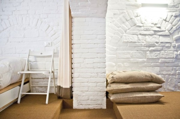
Did I miss something or does it appear that their furniture is filled bags and pillows? The only actual furniture in the photos I see is the bed.
Each culture has its own ideas about furniture and comfort. We no longer question the bamboo mats used by most people in Japan for seating. Perhpas in this part of Italy cushions are the acceptable seating choice and other furniture considered impractical. To each his own.
I found the kitchen. In first two pics, it is to the left of the table. Third pic shows it. There is a screen covering it, so it continues the white all the way down the wall. Looks very basic — stovetop, sink & fridge maybe on the left.
Nice for someone who likes that stark white minimalism; I’d love the space, but would design it totally differently. Nice size for a couple.
My Eyes My Eyes to much WHITE — but definitely pretty cool
LOL, agree, almost blinded me.
Gawd this is beautiful. The loft is to die for. Lofts rule.
“The loft is to die for. Lofts rule.”
Off with her head said the Loft, off with her head. LOL
As much as a loft is NOT functional for my future small home plans, this loft is one that I could see myself in right now!! I love the design! Freshly painted ALL white, modern finishes and minimalistic design definitely gives the space light and the appearance of spaciousness. However, all that white seems clinical and cold, especially on the first level of the apartment near the entrance & kitchen. To me, those are the spaces where I would prefer some warmth and oh…maybe…SOME COLOR?!? Lol!
I too agree with Sally, painted brick covers up the story of the place and hides the character. Though the white painted brick looks very clean, I would have been cool if an entire wall was left unpainted as an accent & offset to the remainder of the white walled brick. But…since the whole place is white, some bold dark & neutral paintings AND some Sepia + Black & White photos could serve as a accent wall in the dining area & accent wall above the stairs, which I think could bring a little warmth to this apartment as well. The loft upstairs seems very warm and inviting due to the soft lighting, wood and neutral color scheme. I would love to see either a wrought iron or birch wood banister running along the edge of the loft for the sake of safety. BTW…that desk looks ginormous!! Lol.
I actually love this apartment design…just wish it had one untouched brick wall and some more neutral accents (besides rice & potato sacks) up in there.
Whats the square footage of this apartment? The white does make it look huge!! Thank You Robert Ferguson for sharing this nicely appointed space. Good find Alex! This apartment is a really nice one!
Too, that bathroom is gorgeous and quite large! I LOVE IT!! The frosted blue glass wall is to die for!!
Did I say I LOVE THIS BATHROOM? Lol!!
(^_^)
I love this apartment, but without a handrail, or banister, you’d find me on the floor with my head…..well…you know….
Ohhh nooo Susan…
We won’t even entertain the thought of “you know….”. We’ll think Happy Thoughts…and Banisters. Lol.
Beautiful apartment but I wish people would be a lot more prudent with white paint. It’s a shame to see that natural old brick covered with all that white. It destroyed the natural beauty of the brick and while it makes it really bright in there, it also makes it ‘cold’.
Otherwise, it’s a great layout, has clean lines, and for a small space has a several secluded areas so two or more people can have some separate space as desired.
Beautiful, but those stairs. No late night drinking there.
I am impatient with this non-functional space. I love minimalist design and decor. gunny sacks are trash, not decor. the ?kitchen? is not good enough to even be one of the heat up only type of cooks. this place is good to take a bath or shower but not other possible function. bah humbug
Compared to all the spectacular Japanese designs and structures is is both an aesthetic and functional FAIL.
Beauty is in the eye of the beholder. Perhaps the owner isn’t finished decorating or is waitingfor the perfect piece of art to show up, or is making an ecological statement by using materials in another way rather than spending dollars on posh plush pillows and cushions becuase he or she gives money to charity instead. Perhaps because it was a shop before a loft it was already painted white and rather than putting a bunch of chemicals into the environment to strip the paint or repaint, they opted to keep it as it was. Perhaps it would be more copasetic to mention what we like about it first before we mention what we don’t like. Just some perhapses to consider.
There is no requirement that comments or opinions must be positive. The moderator is the only one who may decide what can be said. Copasetic?
My reply was neither positive nor negative but neutral, offering possible explanations for your impatient and arrogant assessment of someone else’s self-expression, who was brave enough to expose themselves to negative criticism such as yours. Be “negative” all you want. Makes me no never mind.
“The common man prays, ‘I want a cookie right now!’ And God responds, ‘If you’d listen to what I say, tomorrow it will bring you 100 cookies.”
“When we get impatient because something is taking too long, we should remember that Life waits on us a thousand times more than we wait on Life.”
“When you wear the weed of impatience in your heart instead of the flower Acceptance-with-Joy, you will always find your enemies get an advantage over you.”
good grief!
An informed opinion is one thing, insulting another’s taste is unneccessary. There are kind ways of saying things.
Alex, it is OK to not post these irritable remarks/comments I apologize. Thank you for your service in showing so many examples of small and tiny dwellings. I enjoy all the variety, much of which is extraordinary.
This firm does creative and beautiful work 🙂
Thanks, Alex, for showing us this apt. It’s great to be able to see such a variety of options for simplified living. The interplay of light is so beautiful here . . . the sea-glass window . . . the gauzy shade over the kitchen alcove. Both bring a dreamy quality to the functional space. That window has the same mesmerizing effect as a fire in a fireplace – just on the cool side. I would pull up a couple of pillows there and read to my heart’s content in the glow!
p.s. I just realized that the “sea glass window” is another gauzy blind. I would be reading by the bluish light emanating from the bathroom. Well, why not? The lighting is just magical!
I agree about the need of a stair rail, but I would gladly crawl up & down, wrapping my hand firmly around the stairs to live here. Probably would add an attractive basket hoist for the up & down of bedding.
Several people have commented about the lack of color, but white makes the space look bigger an brighter. The building appears to be older, I doubt the walls would have looked nice unpainted. The person who lives in the apartment is a young professional and may not have the resources or desire to acquire a lot of furniture. The minimalistic furnishings would also make it easier to be mobile when necessary. Great job!
I live in a 100+ year-old small subterranean space with a similar diffuse natural light. Trust me, white painted bricks are absolutely the best way to go in this situation.
Note the uneven masonry courses and decades of patchwork and repairs on those walls. Under bright white they are still present but suddenly chic.
White allows for versatility, is excellent for displaying art, and permits a systematic introduction of color as one prefers with fabrics/upholsteries, and is super in a low-light area.
That said I’m not so fond of the blond wood combinations with the white – it’s a matter of taste. I’ve gone with clear glass with wrought iron, dark grays, black accents and where fine furniture is involved, cherry wood.
However the big fail in this delightful apartment: those stairs are a recipe for disaster with both open treads and lack of railing.
While I love the Escher-esque look of them, anyone of any age or condition could easily miss their step, catch a toe and fall. Introduce the slightest variable – high heels, sports injuries, geriatric balance, grand babies and tots, pets – a cat, dog, or other unexpected obstacle on a step in the dark including the possibility that more than one person could be negotiating the steps at one time – yeah ok live large, live on the edge: until you sustain an unforgiving head-injury.
They’re totally not worth it: form has to meet function.
Overall this is an enviably romantic dream.
Aside from the bed, the space looks very uncomfortable.
I love this apartment, especially its white walls. There are few windows and I imagine the white really brightens up the place. It seems to be designed for simply, easy living for very busy students or professionals. I love the bed alcove. Nicely done!
That beautiful, some architects are concerned about the daltonians!
Serious whould be if their not know to like harmonize the white…The building is old, but whitewashed hasty as the backwoodsman or campesinos how whitewash the their old homesteads before by reside.
Why is the bathroom sink at the same level as the toilet?? Is the owner a “little person”?
The brick is nice. Those stairs have got to go!! All in all, it’s ok.😌